GIS is mentioned on every A level specification and the majority of GCSE specs. In a nutshell GIS is a means of representing and analysing spatial data using IT. It is an incredibly powerful tool and one that our students should be familiar with. Despite this, based on my experiences in schools as well as informal conversations with other departments and teachers it is an area of the subject that is often integrated poorly into geography curricula. I think that there are a multitude of reasons for this but chiefly it is down to:
This is a real shame. GIS has massive potential to engage secondary students in geography. Speaking for myself the first time I encountered GIS at university I felt like I was really applying my subject knowledge and investigating / forming conclusions under my own steam. It is incredibly satisfying to enter the data and see a beautiful spatial representation appear in front of you. I have previously blogged about some of my thoughts on GIS in secondary schools here http://maxrayner.wordpress.com/2011/07/04/some-thoughts-on-gis-in-the-secondary-classro/.
This post is an outline / evaluation of some of the free web based GIS tools that are available to geographers. I was introduced to many of these at the Cardiff University case studies day. Like many things GIS is going open access; this is a really exciting time for GIS in secondary schools.
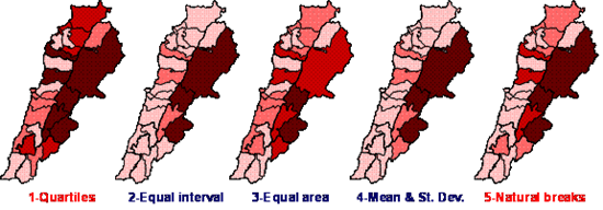
Before launching into a review of some of the resources shown to me today I want to discuss a very real pitfall of data represented by GIS and something that students need to be aware of. One of the simpler GIS and something that students will be manipulating and analysing most often are computer generated choropleth maps. The way that the data intervals in choroplelth maps are defined can have a big impact on the spatial patterns that emerge, the image below is a great example of this.
- A lack of confidence and understanding from teachers about exactly what GIS is.
- Expensive, complicated software.
- A lack of direction from exam boards and a lack of collaboration with universities.
This is a real shame. GIS has massive potential to engage secondary students in geography. Speaking for myself the first time I encountered GIS at university I felt like I was really applying my subject knowledge and investigating / forming conclusions under my own steam. It is incredibly satisfying to enter the data and see a beautiful spatial representation appear in front of you. I have previously blogged about some of my thoughts on GIS in secondary schools here http://maxrayner.wordpress.com/2011/07/04/some-thoughts-on-gis-in-the-secondary-classro/.
This post is an outline / evaluation of some of the free web based GIS tools that are available to geographers. I was introduced to many of these at the Cardiff University case studies day. Like many things GIS is going open access; this is a really exciting time for GIS in secondary schools.
Before launching into a review of some of the resources shown to me today I want to discuss a very real pitfall of data represented by GIS and something that students need to be aware of. One of the simpler GIS and something that students will be manipulating and analysing most often are computer generated choropleth maps. The way that the data intervals in choroplelth maps are defined can have a big impact on the spatial patterns that emerge, the image below is a great example of this.
You can see that the main classification methodologies produce similar, but distinct patterns when finally mapped. Students should be able to evaluate the methodology they applied for setting classifications. At the least I think they should be aware that different approaches exist, particularly A level students. I wont launch into a detailed discussion of these methods in this post but an excellent explanation can be found here http://www.directionsmag.com/articles/choropleth-mapping-with-exploratory-data-analysis/123579. Now to review some of the resources I have seen today which focus on data from the 2011 census:
2011 Census Open Atlas Project - http://www.alex-singleton.com/2011-census-open-atlas-project/
This is a project developed by Alex Singleton, a lecturer in GIS at Liverpool University. This is why he created them (from his own website)
Office for national statistics interactive content - http://www.ons.gov.uk/ons/interactive/index.html#Census
This provides some good opportunities for comparison between the 2001 and 2011 census although the interface is quite clunky and the search feature isn't great. Still there is some good data here and if you spend some time exploring / getting used to the interface there are some excellent learning opportunities to be had. Data is mapped using the equal interval classification and this cannot be changed.
Office for national statistics neighbourhood statistics - http://www.neighbourhood.statistics.gov.uk/dissemination/LeadHome.do?m=0&s=1371585854758&enc=1&nsjs=true&nsck=false&nssvg=false&nswid=1366
The user experience is a friendlier one here and there are more opportunities for data manipulation. Once you have found the area of interest and selected the spatial scale and statistic you can view the information as a map. You can change the number of divisions and there are hundreds of thousands of possibilities for mapping census information.
InfoBase Cymru - http://www.infobasecymru.net/IAS/eng
This data is only available for Wales but is one of the best interfaces. Also there is more opportunity to manipulate the data, for example you can alter the classification method and compare the impacts this has on the pattern that emerges.
Creating your own maps
I am yet to have a proper play around with these resources yet but the potential in terms of students using a real piece of GIS software to create their own spatial data representations from scratch is really exciting. The QUANTUM GIS PROJECT http://www.qgis.org/ is a free to download piece of software. The website has manuals and tutorials for users. Together with census data downloadable here http://www.nomisweb.co.uk/census/2011/bulk/r2_2 and the boundary data available here https://geoportal.statistics.gov.uk/geoportal/catalog/main/home.page departments can fully integrate GIS from scratch into their A level teaching.
To conclude
There is far more material for discussion here than one post allows. As I develop resources and lessons based on these open source GIS I will of course share with everyone, perhaps some how to guides might be in order. It is a really exciting time for GIS, it is one of the sharp ends of the subject and people's contact with it is increasing as technology advances. I am going to be taking charge of developing GIS teaching for my department and think that some of these resources will be incredibly useful. I would love to hear about what other departments are doing with regard to GIS so get in touch!
2011 Census Open Atlas Project - http://www.alex-singleton.com/2011-census-open-atlas-project/
This is a project developed by Alex Singleton, a lecturer in GIS at Liverpool University. This is why he created them (from his own website)
- To demonstrate the value of the 2011 census
- Provide a free 2011 static Census atlas to anyone who wants one
- Because I do not believe web maps should necessarily be the default way of distributing geographic data
- To illustrate how open data and software can be used in creative ways to generate insight
- An attempt to save local authorities money who might be thinking of doing these type of analyses themselves
- To provide reproducible code that enable others to generate similar maps at Output Area level
Office for national statistics interactive content - http://www.ons.gov.uk/ons/interactive/index.html#Census
This provides some good opportunities for comparison between the 2001 and 2011 census although the interface is quite clunky and the search feature isn't great. Still there is some good data here and if you spend some time exploring / getting used to the interface there are some excellent learning opportunities to be had. Data is mapped using the equal interval classification and this cannot be changed.
Office for national statistics neighbourhood statistics - http://www.neighbourhood.statistics.gov.uk/dissemination/LeadHome.do?m=0&s=1371585854758&enc=1&nsjs=true&nsck=false&nssvg=false&nswid=1366
The user experience is a friendlier one here and there are more opportunities for data manipulation. Once you have found the area of interest and selected the spatial scale and statistic you can view the information as a map. You can change the number of divisions and there are hundreds of thousands of possibilities for mapping census information.
InfoBase Cymru - http://www.infobasecymru.net/IAS/eng
This data is only available for Wales but is one of the best interfaces. Also there is more opportunity to manipulate the data, for example you can alter the classification method and compare the impacts this has on the pattern that emerges.
Creating your own maps
I am yet to have a proper play around with these resources yet but the potential in terms of students using a real piece of GIS software to create their own spatial data representations from scratch is really exciting. The QUANTUM GIS PROJECT http://www.qgis.org/ is a free to download piece of software. The website has manuals and tutorials for users. Together with census data downloadable here http://www.nomisweb.co.uk/census/2011/bulk/r2_2 and the boundary data available here https://geoportal.statistics.gov.uk/geoportal/catalog/main/home.page departments can fully integrate GIS from scratch into their A level teaching.
To conclude
There is far more material for discussion here than one post allows. As I develop resources and lessons based on these open source GIS I will of course share with everyone, perhaps some how to guides might be in order. It is a really exciting time for GIS, it is one of the sharp ends of the subject and people's contact with it is increasing as technology advances. I am going to be taking charge of developing GIS teaching for my department and think that some of these resources will be incredibly useful. I would love to hear about what other departments are doing with regard to GIS so get in touch!


 RSS Feed