The IPCC recently published the first part of its fifth review. I remember studying for my BSc in 2007 when the 4th came out. The report is close to 10'000 pages and contains over 9400 citations. It is quite a beast. However it is such a relevant, contemporary resource it would be a shame for our students not to access it due to its size!
With this in mind I have created a student friendly summary, it is 2 pages of text and 3 pages of figures. It summarises the main conclusions and has some of the key stats. I hope that you find it useful and can incorporate it into your teaching of climate geography.
student_friendly_version_of_ipcc_summary.docx
File Size: 922 kb
File Type: docx
Download File

 
There is a lovely animation of population change to be found on Benjamin Hennig's blog which could have plenty of uses in lessons http://www.viewsoftheworld.net/wp-content/uploads/2011/10/WorldPopulationAnimation.gif. Benjamin also goes into a detailed discussion about some of the issues surrounding population projections, this would be good extension work for A Level students. 

If you have never seen Benjamin's blog before it really is worth following. http://www.viewsoftheworld.net/. Here is Ben's bio straight from the website:

"Meet the author
Benjamin is an academic geographer educated at the Universities of Cologne & Bonn and the Alfred Wegener Institute for Polar and Marine Research(Bremerhaven/Germany) where he conducted research on hyperspectral remote sensing applications in coastal ecosystems. After working as a research assistant and lecturer in human and urban geography at the Urban and Social Geography Working Group of the Department of GeographyUniversity of Cologne (Germany) he joined the Social and Spatial Inequalities Research Group at the University of Sheffield (UK). He completed his PhD as part of theWorldmapper project with research on visualising the social dimensions of our planet. He continues to work as a senior research fellow at the Department of Geographyresearching social inequalities, humanity’s impact on Earth, global sustainability and new concepts for the visualisation of these issues."

 
GIS is mentioned on every A level specification and the majority of GCSE specs. In a nutshell GIS is a means of representing and analysing spatial data using IT. It is an incredibly powerful tool and one that our students should be familiar with. Despite this, based on my experiences in schools as well as informal conversations with other departments and teachers it is an area of the subject that is often integrated poorly into geography curricula. I think that there are a multitude of reasons for this but chiefly it is down to:
  • A lack of confidence and understanding from teachers about exactly what GIS is.
  • Expensive, complicated software.
  • A lack of direction from exam boards and a lack of collaboration with universities.

This is a real shame. GIS has massive potential to engage secondary students in geography. Speaking for myself the first time I encountered GIS at university I felt like I was really applying my subject knowledge and investigating / forming conclusions under my own steam. It is incredibly satisfying to enter the data and see a beautiful spatial representation appear in front of you. I have previously blogged about some of my thoughts on GIS in secondary schools here http://maxrayner.wordpress.com/2011/07/04/some-thoughts-on-gis-in-the-secondary-classro/.

This post is an outline / evaluation of some of the free web based GIS tools that are available to geographers. I was introduced to many of these at the Cardiff University case studies day. Like many things GIS is going open access; this is a really exciting time for GIS in secondary schools. 

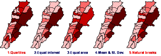
Before launching into a review of some of the resources shown to me today I want to discuss a very real pitfall of data represented by GIS and something that students need to be aware of. One of the simpler GIS and something that students will be manipulating and analysing most often are computer generated choropleth maps. The way that the data intervals in choroplelth maps are defined can have a big impact on the spatial patterns that emerge, the image below is a great example of this.
You can see that the main classification methodologies produce similar, but distinct patterns when finally mapped. Students should be able to evaluate the methodology they applied for setting classifications. At the least I think they should be aware that different approaches exist, particularly A level students. I wont launch into a detailed discussion of these methods in this post but an excellent explanation can be found here http://www.directionsmag.com/articles/choropleth-mapping-with-exploratory-data-analysis/123579. Now to review some of the resources I have seen today which focus on data from the 2011 census:

2011 Census Open Atlas Project - http://www.alex-singleton.com/2011-census-open-atlas-project/ 
This is a project developed by Alex Singleton, a lecturer in GIS at Liverpool University. This is why he created them (from his own website)
  1. To demonstrate the value of the 2011 census
  2. Provide a free 2011 static Census atlas to anyone who wants one
  3. Because I do not believe web maps should necessarily be the default way of distributing geographic data
  4. To illustrate how open data and software can be used in creative ways to generate insight
  5. An attempt to save local authorities money who might be thinking of doing these type of analyses themselves
  6. To provide reproducible code that enable others to generate similar maps at Output Area level
Why reinvent the wheel? If the data is there why reproduce it? It was an ambitous project and there is certainly some excellent data here. The coding used means that almost every non count variable of the 2011 census has been mapped at the Output Area scale. Some of the limitations are that there is no scale bar and there is no opportunity for students to manipulate the data themselves but certainly a useful resource to have up your sleeve.

Office for national statistics interactive content - http://www.ons.gov.uk/ons/interactive/index.html#Census
This provides some good opportunities for comparison between the 2001 and 2011 census although the interface is quite clunky and the search feature isn't great. Still there is some good data here and if you spend some time exploring / getting used to the interface there are some excellent learning opportunities to be had. Data is mapped using the equal interval classification and this cannot be changed.

Office for national statistics neighbourhood statistics - http://www.neighbourhood.statistics.gov.uk/dissemination/LeadHome.do?m=0&s=1371585854758&enc=1&nsjs=true&nsck=false&nssvg=false&nswid=1366

The user experience is a friendlier one here and there are more opportunities for data manipulation. Once you have found the area of interest and selected the spatial scale and statistic you can view the information as a map. You can change the number of divisions and there are hundreds of thousands of possibilities for mapping census information. 

InfoBase Cymru - http://www.infobasecymru.net/IAS/eng
This data is only available for Wales but is one of the best interfaces. Also there is more opportunity to manipulate the data, for example you can alter the classification method and compare the impacts this has on the pattern that emerges. 

Creating your own maps
I am yet to have a proper play around with these resources yet but the potential in terms of students using a real piece of GIS software to create their own spatial data representations from scratch is really exciting. The QUANTUM GIS PROJECT http://www.qgis.org/  is a free to download piece of software. The website has manuals and tutorials for users. Together with census data downloadable here http://www.nomisweb.co.uk/census/2011/bulk/r2_2 and the boundary data available here https://geoportal.statistics.gov.uk/geoportal/catalog/main/home.page departments can fully integrate GIS from scratch into their A level teaching. 

To conclude
There is far more material for discussion here than one post allows. As I develop resources and lessons based on these open source GIS I will of course share with everyone, perhaps some how to guides might be in order. It is a really exciting time for GIS, it is one of the sharp ends of the subject and people's contact with it is increasing as technology advances. I am going to be taking charge of developing GIS teaching for my department and think that some of these resources will be incredibly useful. I would love to hear about what other departments are doing with regard to GIS so get in touch!
 
It was an early start this morning to get the train from Paddington (no bears unfortunately) to Cardiff. I had a place booked on the University's case studies day. The idea is that A level teachers receive talks from university researchers on recent developments in Geography that are relevant to A level teaching. There are MANY case studies summarising the research going on completely free to download here http://www.cardiff.ac.uk/cplan/research/cardiff-case-studies. The case studies are regularly updated so keep checking.

The case studies can be used to supplement resources you have already and also provide excellent opportunities for stretching students. Each case study also has a few references included to get students used to referencing correctly. I can't wait to make use of them and get perspectives on contemporary research into my lessons. I think that the material is going to really broaden my students perspectives of what geography 'is'.
 
I picked this up while I was at one of my training schools, unfortunately I have no idea who originally produced it. It is an incredibly useful resource for plenaries. Don't ask me to explain but the kids love the brightly coloured squares!! The idea is that you ask a student to pick a square and they complete the activity, or the whole class can complete it. 

The activities are designed to promote reflective thinking on the knowledge picked up during the lesson. I use this often with my classes and it always produces an effective plenary. 
plenarysquares1.ppt
File Size: 131 kb
File Type: ppt
Download File

 
My GCSE classes are currently working through a unit on development. Watching the news this morning I came across a story that is relevant and interesting. Public Health for England has recently published data showing the regional differences in rates of premature death. This includes cancer, heart disease, stroke and liver disease. There is also data on overall social deprivation.

The website can be found here http://longerlives.phe.org.uk/. The map is interactive and easy to use. We are going to be analysing this in today's lessons, it will be interesting to see the conclusions that the students come to. 
 
A while back I blogged about using GeoGussr and its potential as a lesson resource. Thank you to @MrGeographer for bringing my attention to GeoSettr this morning on Twitter. GeoSettr allows you to create custom challenges and provides a unique URL.

Just some immediate ideas on how this could be used:
  • As a starter in lessons, guessing locations requires a great deal of knowledge and skill. 
  • As a homework task, if you are teaching a unit on Japan for example. Students could take the challenge at home and bring in their scores or write an account of how they made their choices.
  • You could set up 5 different challenges all with contrasting sets of examples from the same location or country e.g. from a variety of biomes that cover the USA. You could give it the big reveal that all locations were actually from the same country which could lead to interesting discussion on climate, ecosystems, any number of things.
 
Picture
This is very encouraging news from the BBC this morning http://www.bbc.co.uk/news/science-environment-22820162. The Marine Stewardship Council has announced that Atlantic cod stocks will reach sustainable levels within years rather than decades. The history of cod is really fascinating and one of my favourite books is 'Cod' by Mark Kurlansky.

The book's prologue is an account of a fishing trip with fisherman from Petty Harbour, Newfoundland. At the time of writing Petty Harbour was one of the only legal fisheries on the Newfoundland coast  The men speak about the cod with respect, you get a real sense that they care about the fish, but also with sadness and frustration at the decline of cod stocks. The men found extra work by carrying out monitoring surveys of the cod population for researchers. I have used this prologue with A Level students when teaching about sustainability. The book is extremely well written and turns what could be a dry subject (excuse the pun) into a thoroughly engaging story.

Our relationship with fish is a funny one. As a nation we only really eat 3 or 4 species, which is madness when you consider the wealth of our fishing resources. Hugh's fish fight was a successful campaign to end the practice of 'discards', a symptom of our appetite for a limited number of species and the quota system forced upon fisherman by the Common Fisheries Policy (CFP). Perfectly healthy fish were being thrown back into the sea, dead, because the fisherman had already caught their fill of that species, or the species wasn't marketable. Footage of this happening is one of the few things that has ever . The fish fight campaign called for an end to discards and increased awareness of other species. In May this year key reforms to the CFP were announced http://www.bbc.co.uk/news/world-europe-22717796

All in all things are looking up for fish.

 
This video from BBC News is  reminder that the management of physical processes is a political game. Coastlines are incredibly dynamic environments. Next time you teach about Holderness or Happisburgh be sure to check that the management policy hasn't changed!

http://www.bbc.co.uk/news/uk-england-22771242
 
Picture
This image and those on this blog are only mock ups but what a thought. I can see some potential for using these images when teaching about development or settlement as this development is currently being built in Mumbai, which contains one of the most populace slums in the world. India is a fascinating country of contrast.

There are so many amazing images out there which can be used to grab students interest.