I have sat through many AFL insets where the virtues of lollipop sticks as a means of ensuring random questioning have been made clear. I am not against this methodology but it is never something that I felt comfortable using in my own classroom.
At the start of the year we were given a big stack of lollipop sticks for just this very purpose. However I thought how can I make these a bit more geographical.
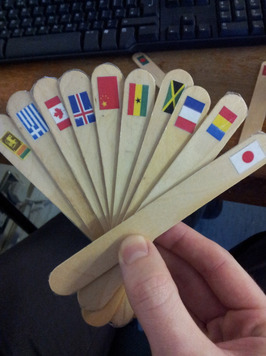
Step 1: Print off 50 mini flags.
Step 2: Sellotape said flags to the lollipop sticks. You have created ‘Flagsticks’ ™
Step 3: Cuppa.
They have proven to be a useful little resource with lots of applications. For example…
When teaching about development indicators with a focus on evaluating indicators and developing comparative thinking. Start the lesson off by defining some development indicators. Ask students to justify how these indicators might look for developed and developing countries.
Pair the students up and gave them an Atlas or stats table, a blank table to fill in and two random ‘flagsticks’. Without telling them the country they use the stats tables in their Atlas to find the country’s flag, fill out the data table with the relevant indicators and make a judgment on whether the country is developed or developing. When they have done this for their two they swap with other students on their table and repeat.
Having done this before it creates a lovely buzz in the room, the type where you know the students are into the task. I am no expert on student’s thinking but I know that had I just given them two random countries they would not have got into the task with such enthusiasm. Give them a little stick with a flag on it and they start crunching data like UN statisticians.
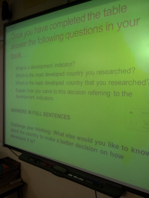
Once they had filled in their tables with 5 countries they can complete some individual questions in their books, cementing the concepts and knowledge the task had developed (see image below)

 RSS Feed